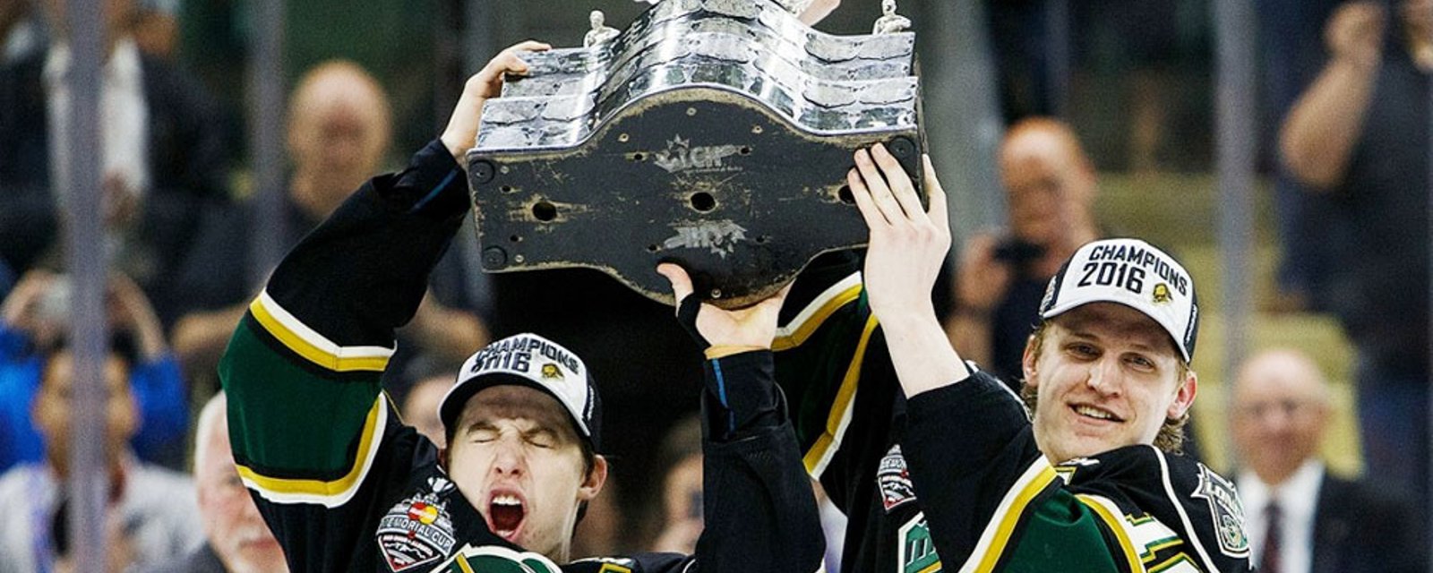
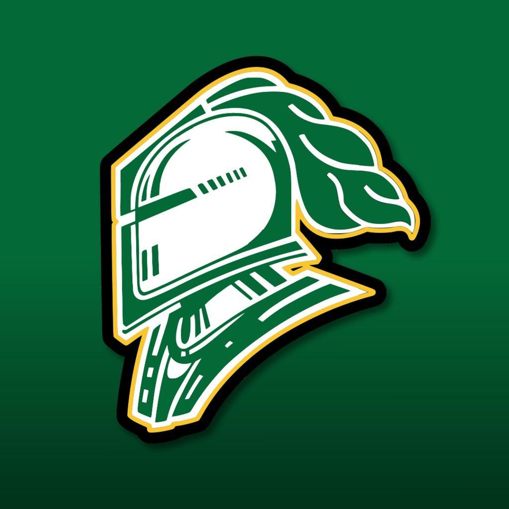
This just in, the London Knights of the Ontario Hockey League (OHL) have made a tweak to their iconic logo for the 2019-20 season. The Knights, of course, are a charter member of the OHL and are one of the most successful franchises in junior hockey history.
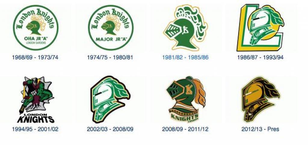
The Knights have two Memorial Cups to their credit and four OHL championships in 54 year history. They’ve used nine different variations on their logo for the existence and the latest iteration is an update on the logo that they’ve been using since 2012.
Check it out:
For reference, here’s the team’s entire logo history:
“To be able to represent many of the previous achievements that this franchise has accomplished, while being able to look forward to the future was incredibly important to us,” said London Knights Owner, Vice-President, and General Manager, Mark Hunter, when discussing the inspiration for the new logo. “To be able to extend the legacy of the amazing young men who have played and lived in London is a continuing priority of ours. In looking to develop the new generation of London Knights, this new logo will serve as a reminder of the hard work, passion, and dedication it means to be a London Knight, as represented by our alumni, both in hockey, and in life.”
Again, it’s a small tweak. It’ll be interesting to see if they team makes any changes to the uniforms they wore this past season:


- HockeyFeed
Reports that Terry Pegula has sold the Buffalo Sabres
- NHL News
- 3 minutes read
- HockeyFeed
Hockey world mourns tragic death of young team captain
- NHL News
- 3 minutes read
- HockeyFeed
Coyotes fans make a plea to Oilers fans for final game in Arizona
- NHL News
- 5 minutes read
- HockeyFeed
Marc-Andre Fleury officially announces his future
- NHL News
- 3 minutes read
- HockeyFeed
Report: Coyotes players go off on Arizona, talk about how happy they are to be leaving
- NHL News
- 6 minutes read