
Rumor: Sabres changing colours for next season
A return to the glory days? Or something new?
HockeyFeed
According to an in depth report from online hockey uniform database Icethetics, there’s a possibility that the Buffalo Sabres will be changing their primary colours for the 2020-21 season (whenever that is).
From Icethetics’ Chris Smith:
Last night, the Sabres were awarded the 8th overall pick via the 2020 NHL Draft Lottery. When sharing the news on social media, they posted this graphic.
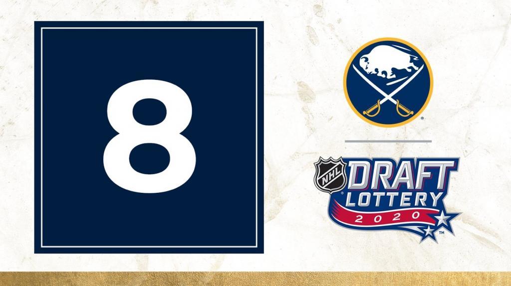
Big deal, right? A tiny Sabres' logo with the classic buffalo and crossed swords. Nothing to see here, right?
More from Smith:
In addition to the simplified Sabres logo, that creative featured hallmarks of the club’s 50th anniversary campaign—which ran throughout the 2019-20 season—including navy blue and grungy gold accents.
You can see a slight difference between the navy blue box and the blue circle of the Sabres logo. It’s not as bright as the original royal blue—nor even as bright as the Montreal Canadiens blue, as seen in the Draft Lottery logo. But it is still an improvement over the silver-outlined version in use for the past 12 years.
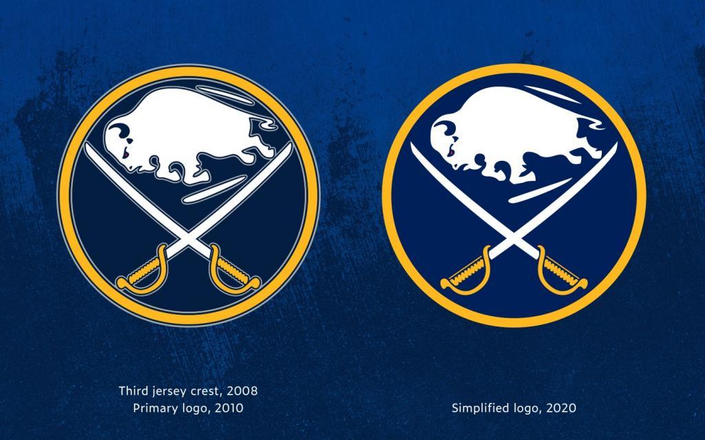
In the image above, the logo on the right is a closer look at the new mark being used on Sabres social media this month.
You’ll notice fewer rounded corners in the new design, which brings it back in line with the original logo from 1970.
Need more proof?
Sabres goalie Linus Ullmark recently shared a photo of his new gear from home in Sweden and the team's usual navy blue has been replaced with the new, brighter blue.
Check it out:

Honestly... whatever the Sabres do, so long as they keep the slug logo dead and in the ground, I'll be happy.
For the full article from Smith, click below:


- HockeyFeed
Reports that Terry Pegula has sold the Buffalo Sabres
- NHL News
- 3 minutes read
- HockeyFeed
Hockey world mourns tragic death of young team captain
- NHL News
- 3 minutes read
- HockeyFeed
Coyotes fans make a plea to Oilers fans for final game in Arizona
- NHL News
- 5 minutes read
- HockeyFeed
Marc-Andre Fleury officially announces his future
- NHL News
- 3 minutes read
- HockeyFeed
Report: Coyotes players go off on Arizona, talk about how happy they are to be leaving
- NHL News
- 6 minutes read