Ducks’ latest concept jersey looks ridiculously strange!
This is the weirdest NHL logo we’ve ever seen!
HockeyFeed
It’s always fun when teams across the National Hockey League show off new concept jerseys and get the comments from fans out there. However, we cannot imagine that anyone will be excited by the new concept jersey for the Anaheim Ducks.
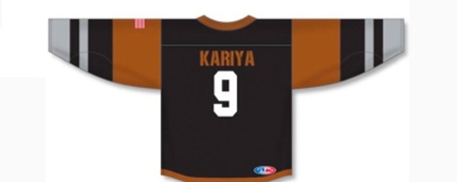
Why? Because it looks ridiculously weird. We’re not sure where to start… First of all, we guess that the Ducks are trying to utilize the team’s new colours, sort of. The orange seems a little burnt and almost brown, but we see where it’s coming from despite the fact that we are used to (and love) the white, green and purple in mockups.
The weirdest thing about the new concept jersey is the logo itself. They are looking to bring on a Ducks sweater with a full-sized duck on it.
Is it an homage to the Flying V?
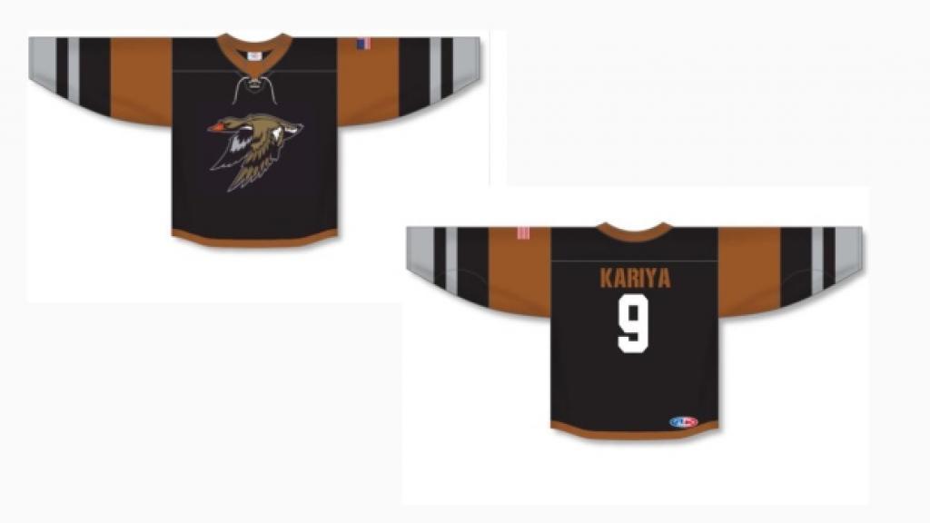
We have to admit it is easy to love the fact that Paul Kariya’s name was used to put on the back of the sweater, but we cannot say we love the concept!
What do you think about it?

- Jonathan Larivee

Brutal comments from Nathan MacKinnon after Game 7 loss.
- NHL News
- 2 minutes read

- Trevor Connors

Capitals forward Taylor Raddysh testifies against his former 2018 World Juniors teammates
- NHL News
- 9 minutes read

- Trevor Connors
Broadcast schedule for Game 1 of Leafs vs Panthers reportedly leaked
- NHL News
- 3 minutes read