
WHL's Prince Albert Raiders forced to discontinue “insensitive and offensive” logo
Thoughts? Personally, it doesn't offend me but I can understand the reasoning behind this decision.
In case you missed the news this past weekend, the WHL's Prince Albert Raiders essentially retired their new throwback third jerseys after just a single day due to an outpouring of criticism from fans and media analysts.
The throwback jersey features a cartoonish Arabian raider logo that the team used from 1982 until it was retired in 1996. The team tried to bring back the look in 2014 but faced criticism even then that the logo was offensive and borderline racist due to its depiction of a crazed looking Middle Eastern marauder.
Here's the logo and jersey in question:
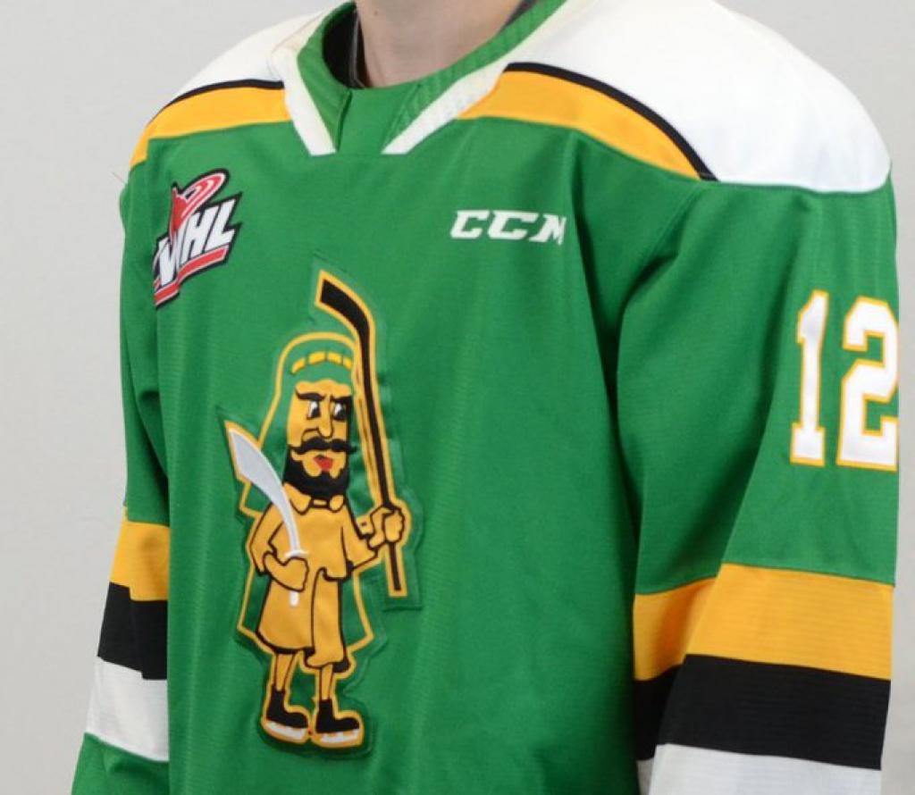
Personally, I'm not offended by this but I'm not about to sit here and tell people what they should and shouldn't be offended by. If I were of Middle Eastern nationality or descent, I might feel differently about things but to me this logo is kind of benign. To be honest at first glance I thought this logo had more of a pirate theme than an Arabian theme anyways. Now that I look closer though, that's clearly not the case and I can understand why it may be offensive to some individuals, especially those with a Middle Eastern background. Again, I'm not about to tell anyone why they should or should not be offended.
In any case, the logo and the jersey were quickly pulled and the WHL was forced to issue a statement:
"On Friday night the Prince Albert Raiders unveiled an alternate third jersey, which was inspired by a highly successful era in Club history," WHL Commissioner Ron Robison said.
"We recognize the dated design is insensitive and offensive. After consultation with the Prince Albert Raiders, this uniform and brand will be discontinued effective immediately... we regret this uniform design was approved and sincerely apologize for any harm it may have caused."
For what it's worth, here's what the Raiders' usual, more modern looking logo looks like (featuring a young Leon Draisaitl):

I think that's actually a pretty sick logo, that's much better than the old one anyways. I don't think the colours pop as much, but the PA and the sword design is certainly more clean and crisp than the silly old cartoon logo the team wore for more than a decade.
Newsletter
Get the latest news and updates directly in your inbox.
Stay ahead of the game with our exclusive hockey news, analysis and insider info.
© 2026 Attraction Web S.E.C. All rights reserved.
ig31d