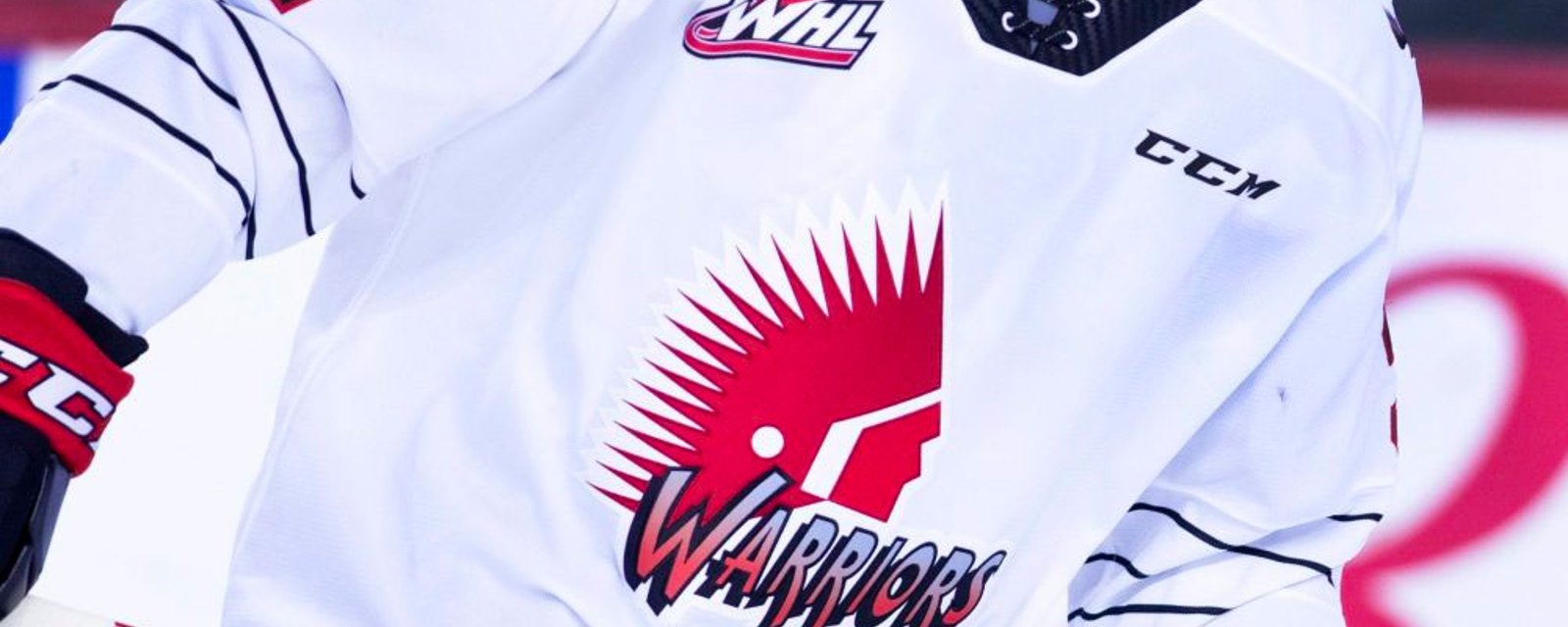
The WHL's Moose Jaw Warriors unveiled a new logo today after conducting a "formal review of their traditional logo."
The original logo, for those unfamiliar with it is the silhouette of a person wearing a traditional headdress:

Now though, the team has switched it up opting instead for a Canadian military based logo featuring the Royal Canadian Air Force's Snowbirds.
Check it out:
Bleh... boring. I much prefer the old logo.
I'm not certain what was wrong with the old logo? Is the term Warriors offensive now? Are native headdresses offensive now? Nonsense. This isn't a name like the Eskimos, the Indians or the Redskins, all of which are clearly outdated, this is the Warriors. Personally, the fetishization of the Canadian military is more offensive than any native art inspired logo I've ever seen, but such is life in 2022 where things rarely make sense.

- Trevor Connors

Craig Berube confirms bad news for goalie Anthony Stolarz
- NHL News
- 3 minutes read

- Chris Gosselin

Brad Marchand offers backhanded compliment to Leafs after Game 2 loss
- NHL News
- 2 minutes read
- Chris Gosselin
Alleged victim in 2018 World Junior case misidentified one player who ends up being current Panther!
- NHL News
- 2 minutes read