Seattle Kraken logos and jersey revealed!
I gotta say... I'm not crazy about the name but they NAILED everything else!
HockeyFeed
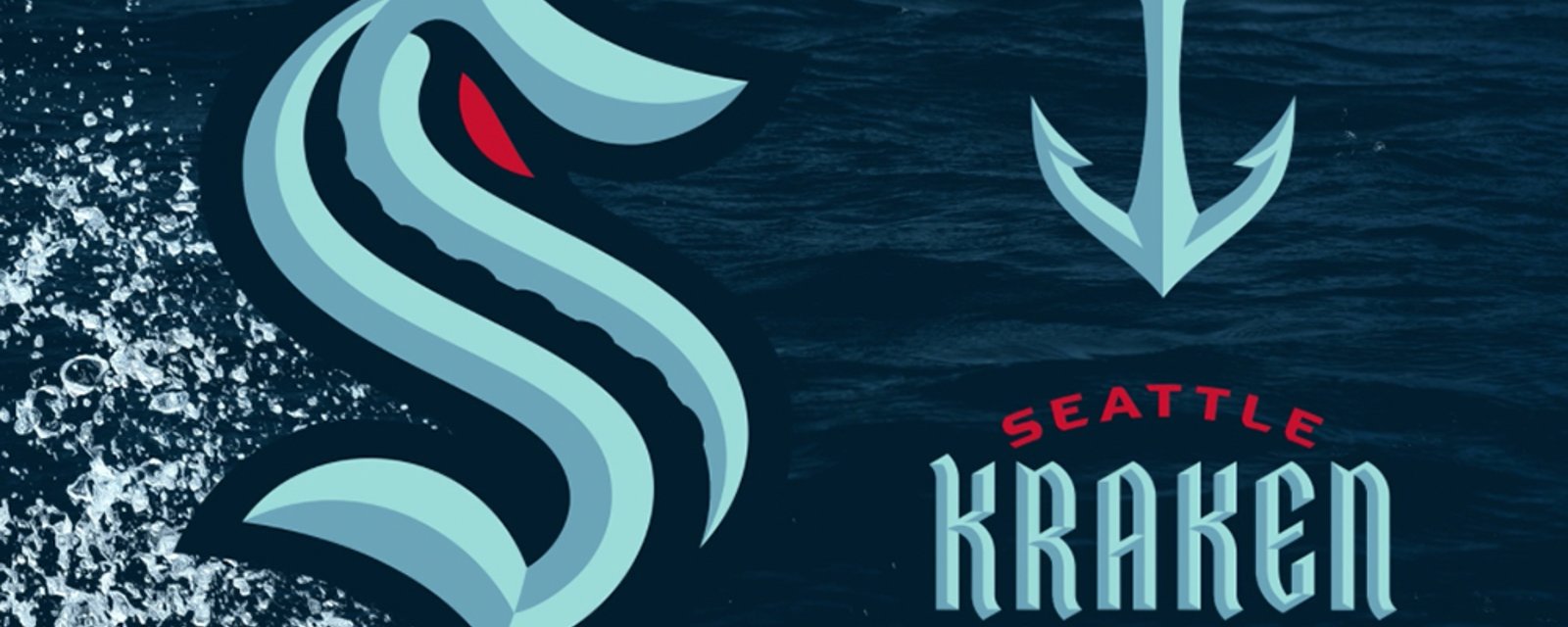
In case you missed it earlier today the Seattle Kraken officially unveiled their team name and logo at an event held on the construction grounds of the team's future arena in downtown Seattle.
Introducing the Seattle Kraken:
Honestly... not bad... not bad at all! I'm not crazy on the team name but they've absolutely NAILED the logo.
But, how about the jersey?
I have to say... I love it!
A full breakdown from our friends at Icethetics:
The “S” form carries on the century-old legacy of America’s first Stanley Cup champions, the Seattle Metropolitans. The eye offers a glimpse of something mysterious within. A swirling tentacle through the middle brings to mind the water that wraps around the city.
The secondary mark is an anchor that transforms into Seattle’s best-known landmark as it rises. The wordmark is as distinctive as the city itself—modern with hints of the past throughout. The beveling used across all of the marks gives them a dynamic, three-dimensional style that you can almost feel.
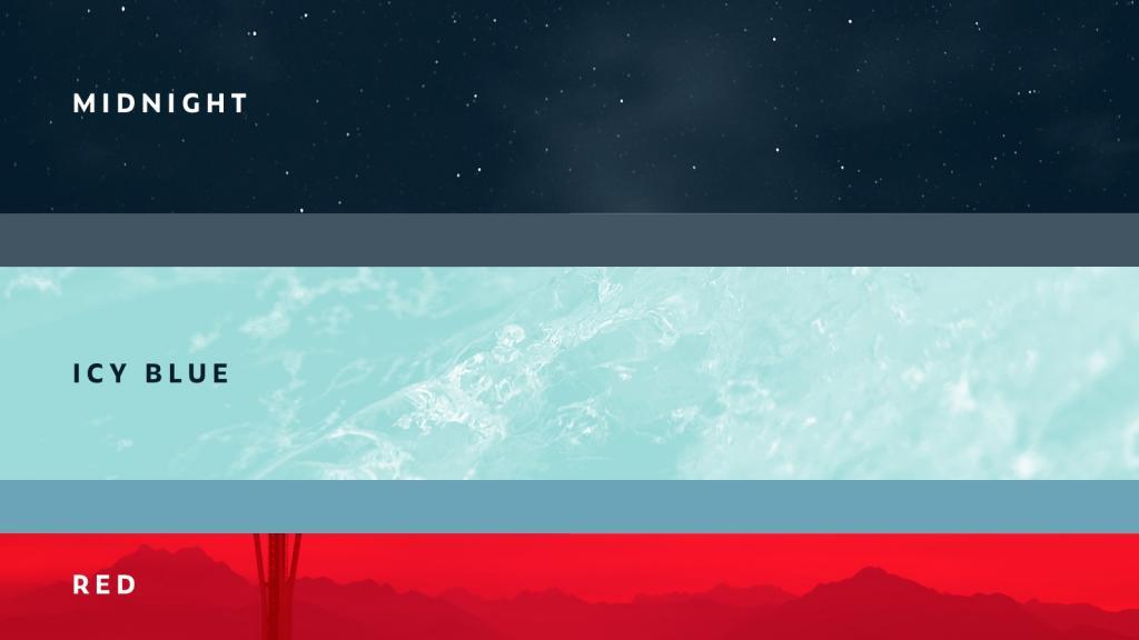
Midnight is the darkest blue the brand creators at Adidas could implement without it being basically black. It evokes the night sky as much as the depths of Puget Sound and the Pacific Ocean.
The icy blue mimics the color of the crystal clear glacial ice found atop Mount Rainier, as much as the surface of Climate Pledge Arena on which the team will skate in 15 short months. A couple of supporting colors in between our midnight and icy blues cover the beveling effects we see.
And the red is true, bright red—not the salmon-esque pastel that’s been the center of speculation for the past year.
Quick side note. Several years ago, a concept designer sent me a Florida Panthers jersey that relied on navy blue, powder blue, and red. I remember wondering why such a great color scheme wasn’t really in use in the NHL. And now this has arrived. Needless to say, I’m a fan.
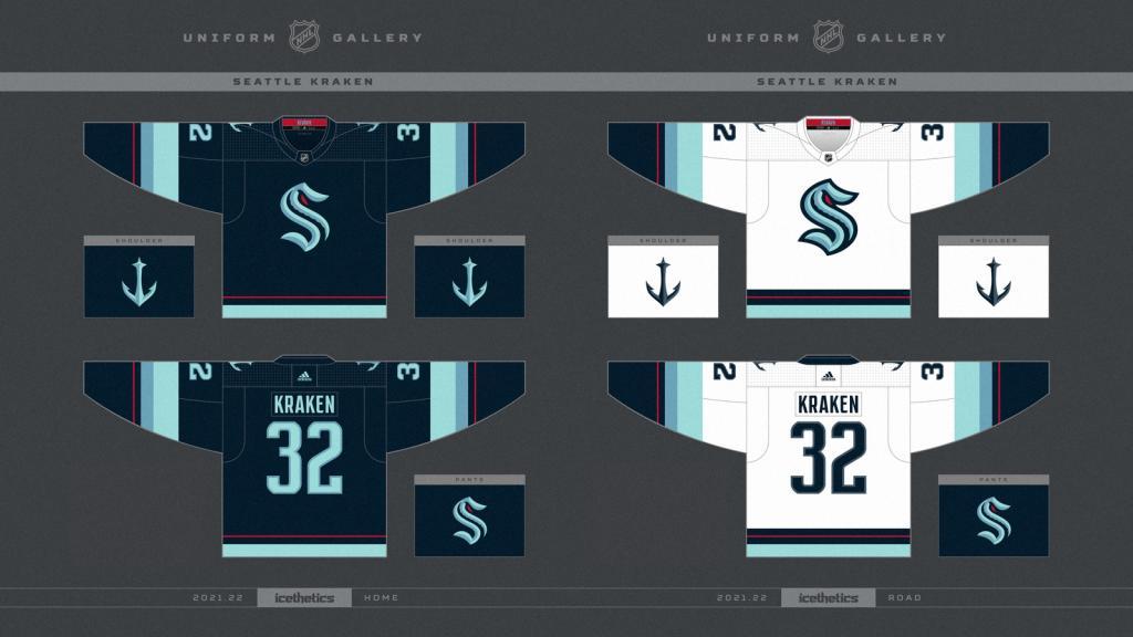
I’m always partial to dark jerseys and this one doesn’t disappoint. But even the white one is working for me here. The striping is consistent across both sweaters and manages to provide a sense of ocean depth.
The thin red line, to me, sort of symbolizes a boundary, almost as if to warn against going any deeper beneath the sea lest you discover some horrifying sea monster waiting to attack. That’s a little of what I mean when I talk about the brilliance of this brand narrative. So many cool little pieces to the puzzle—and there’s probably more we’ll be discovering in the days and weeks to come.
Source: Seattle Kraken
- Jonathan Larivee

Terrible news from Evander Kane just before Game 1.
- NHL News
- 2 minutes read
- Jonathan Larivee
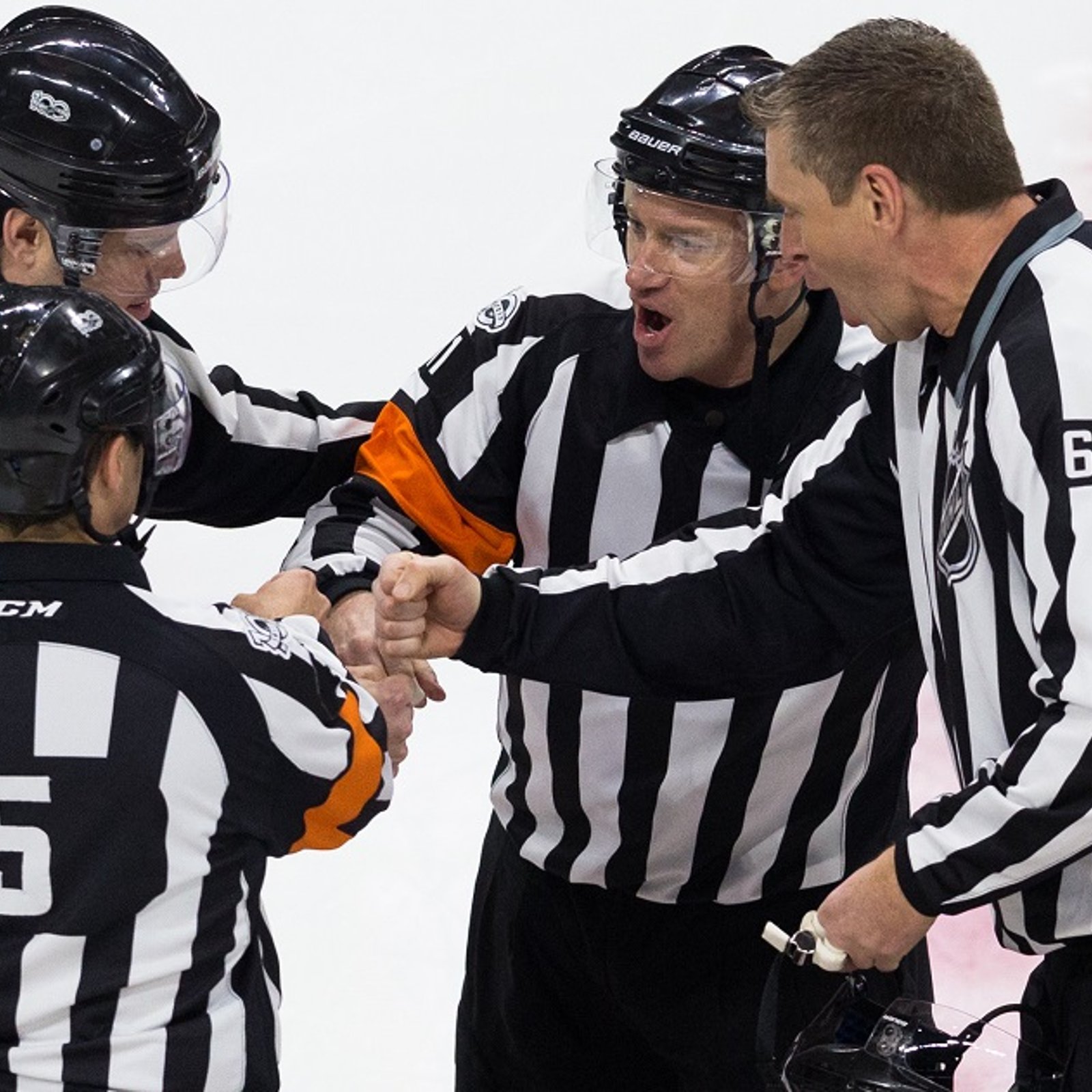
Refs intervene over questionable act from Leafs after Game 1.
- NHL News
- 2 minutes read
- Jonathan Larivee
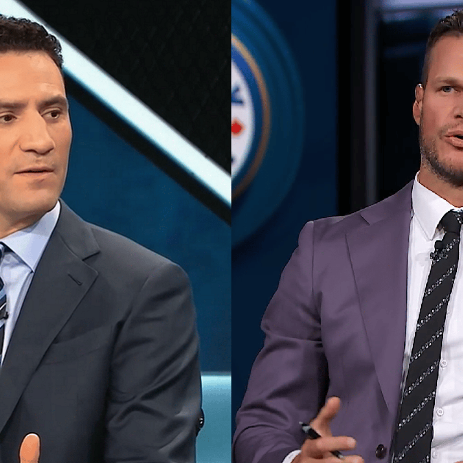
Bieksa, Bissonnette call out 2 Maple Leafs after a brutal Game 1.
- NHL News
- 3 minutes read
- Jonathan Larivee
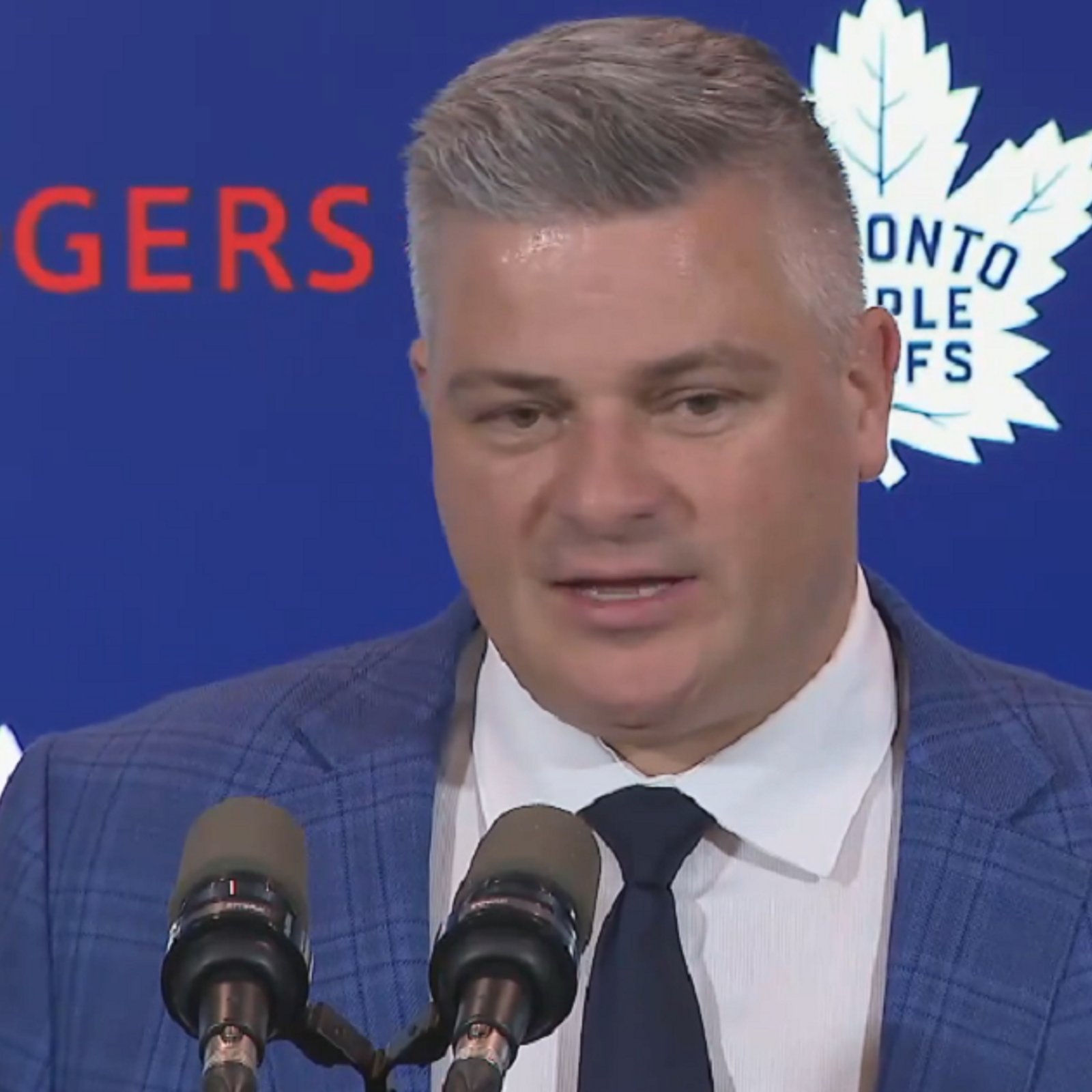
Sheldon Keefe calls out Max Domi over Game 1 performance.
- NHL News
- 2 minutes read

- Jonathan Larivee
Seth Jones' comments rub fans in Chicago the wrong way.
- NHL News
- 3 minutes read